Observations, pictures, and sketches highlight the transition of moving to the nations's Capitol after 30 years of living in the Midwest. A clash in cultures? Maybe not!
Showing posts with label 52frames_complementarycolors. Show all posts
Monday, February 26, 2024
52Frames Complementary Colors Weekly Photo Challenge
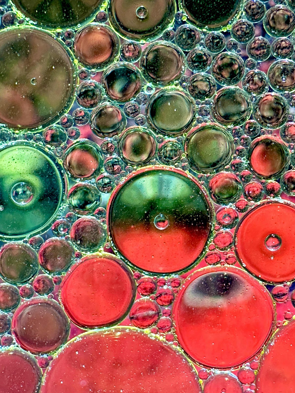
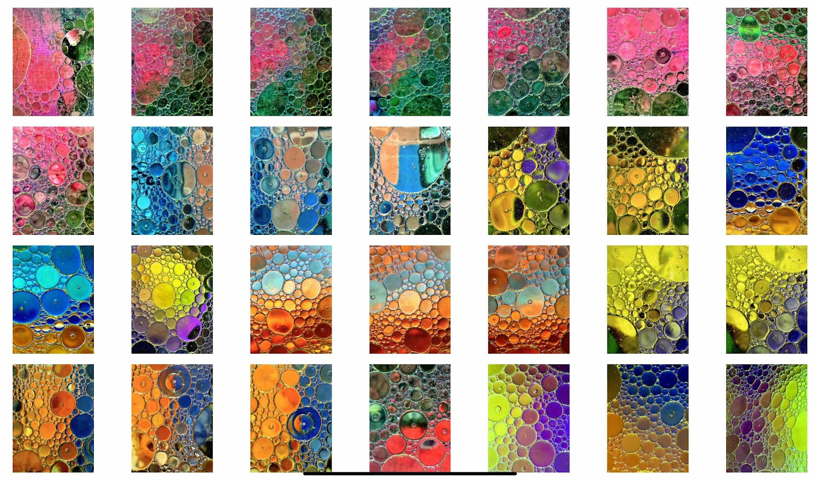
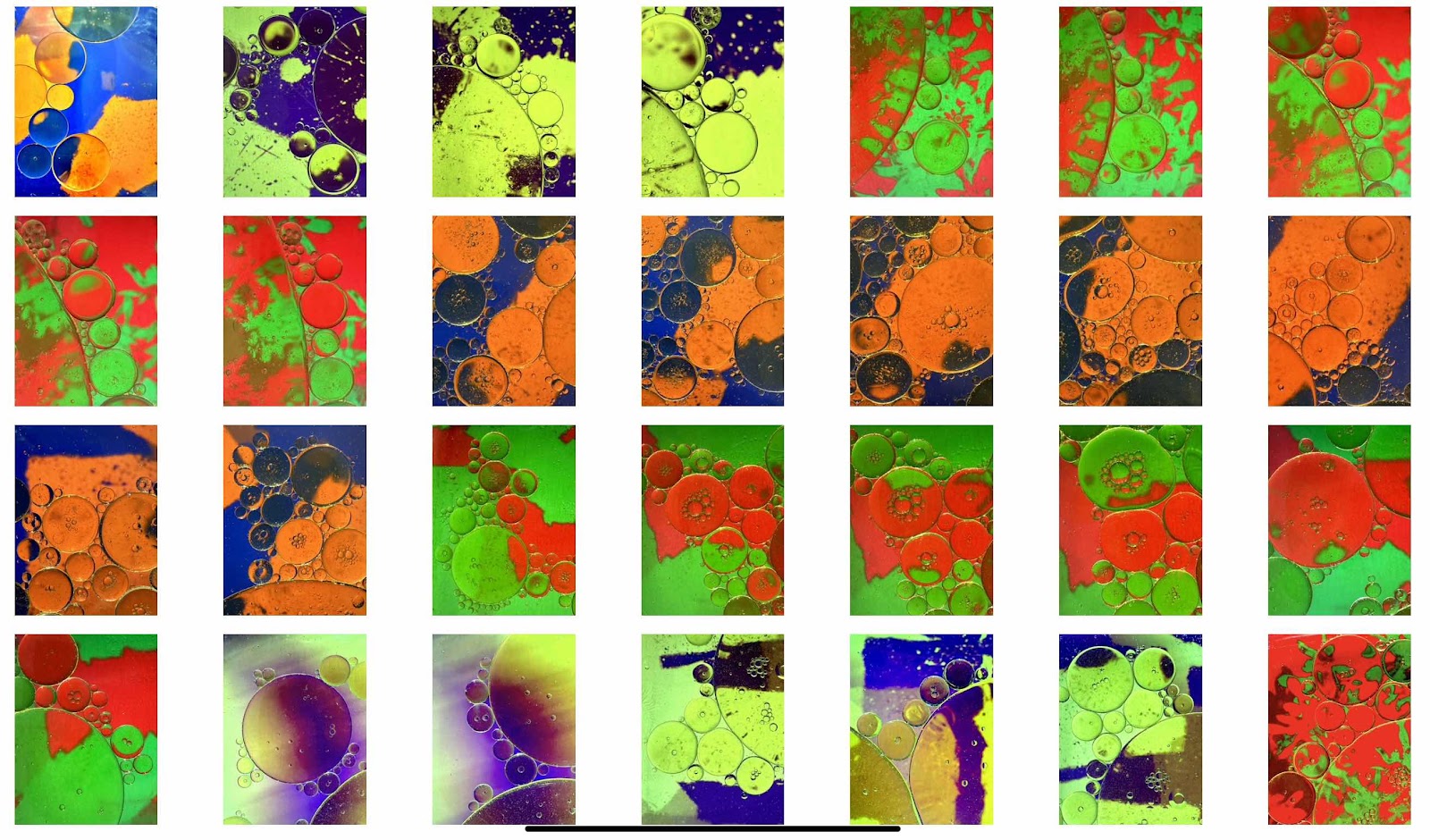
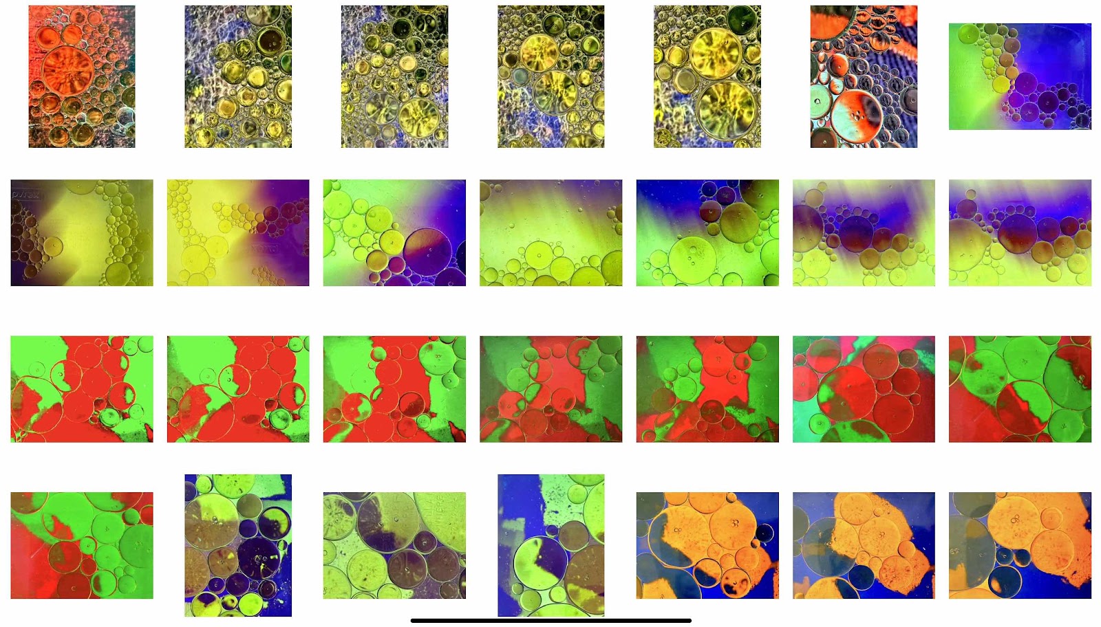
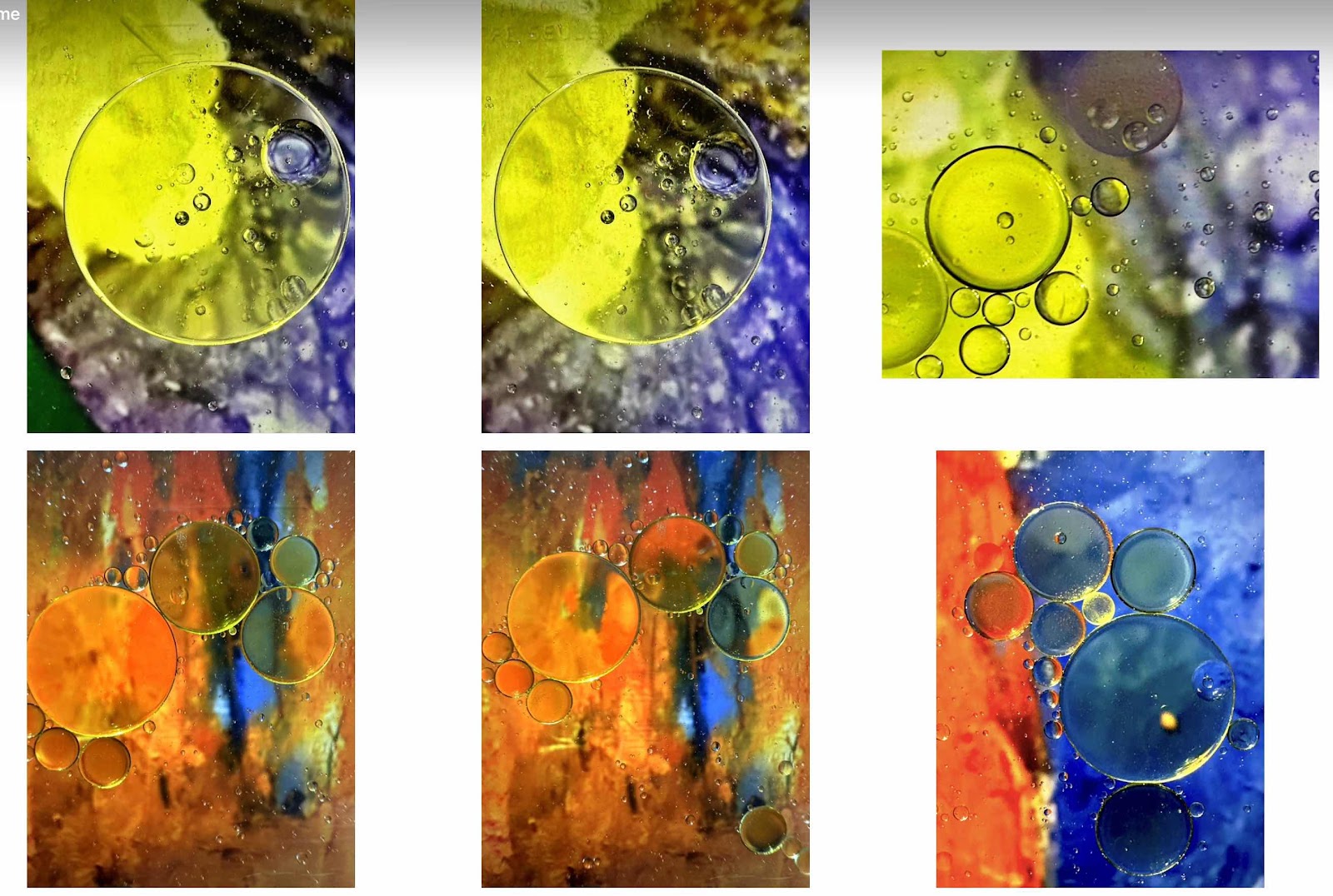
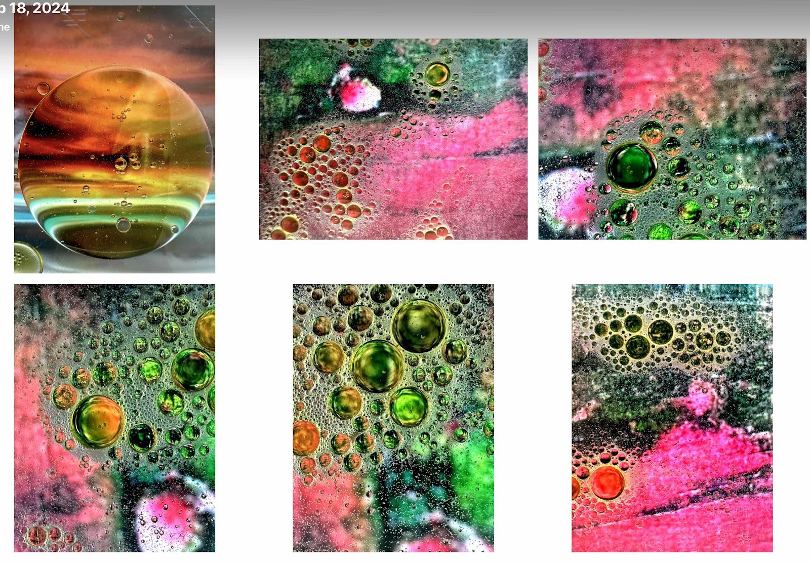
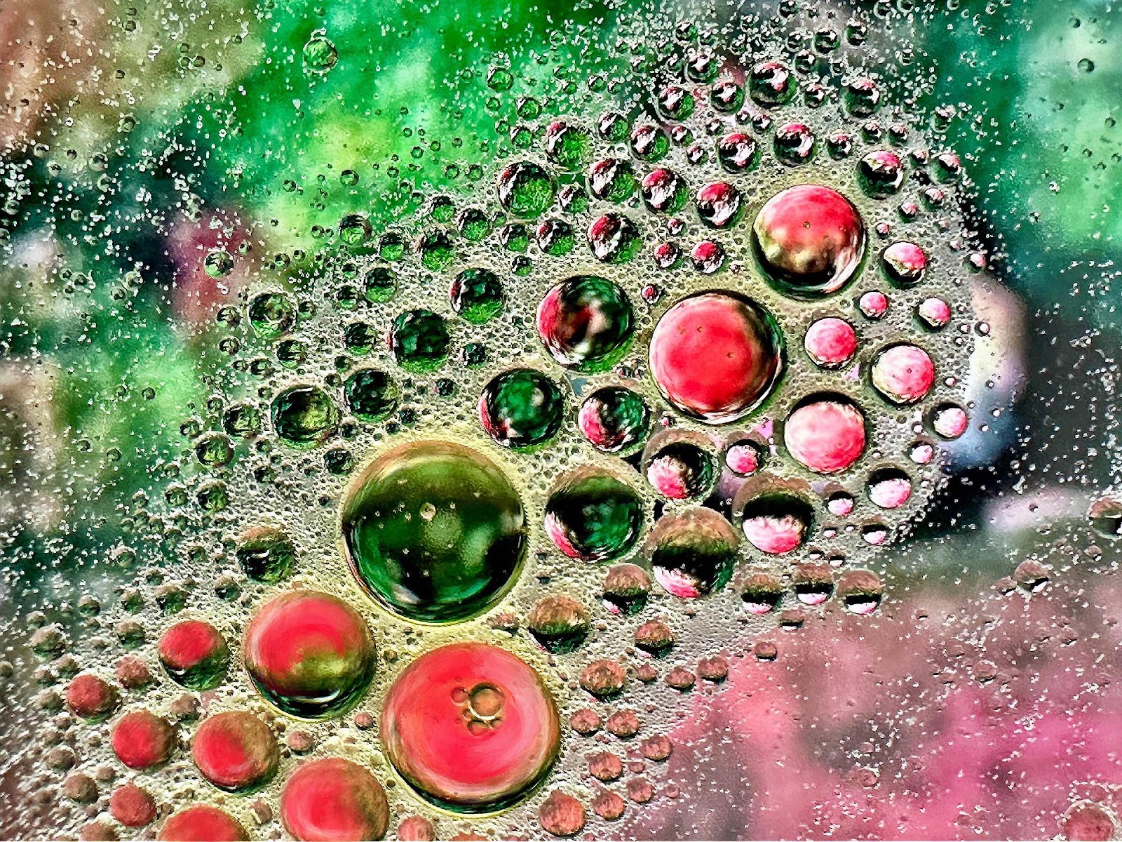
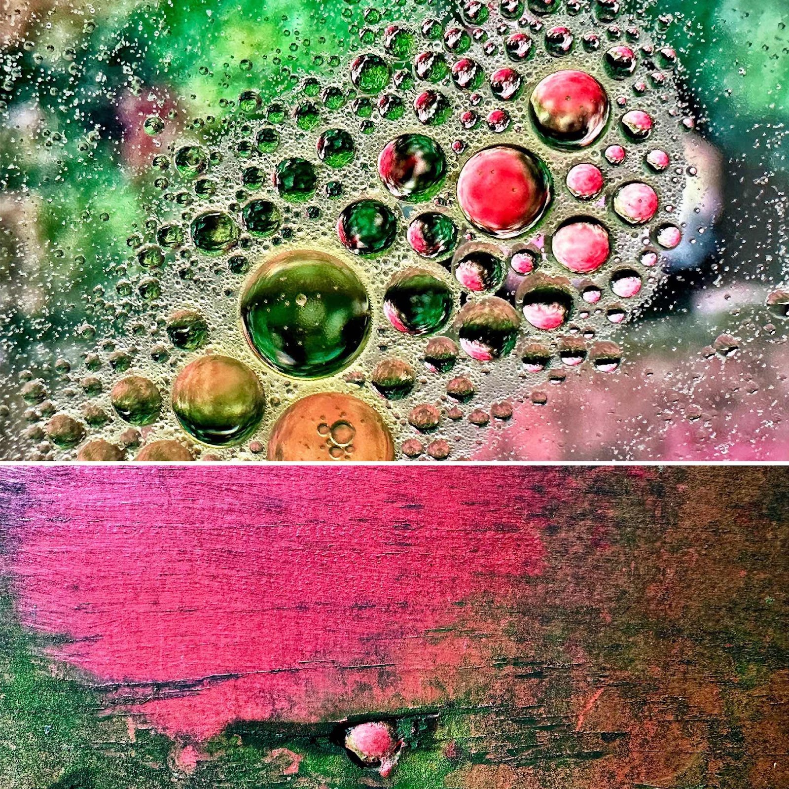
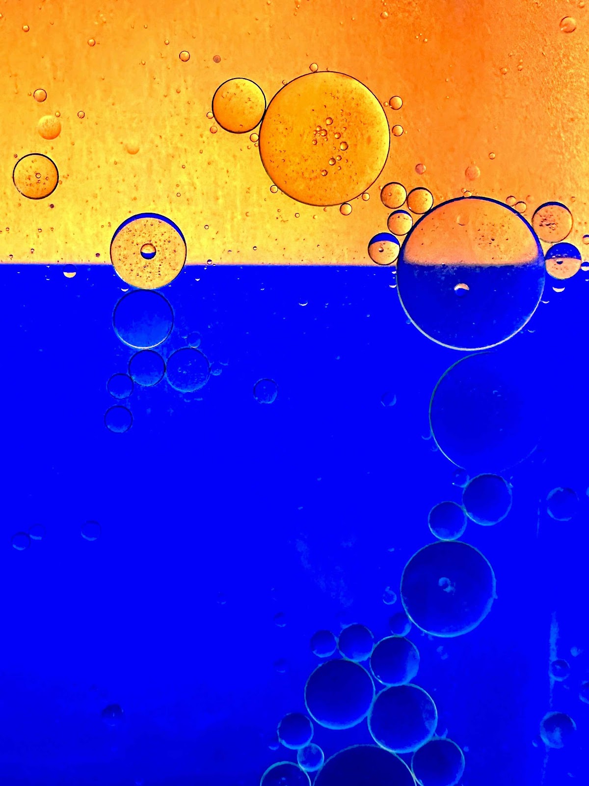
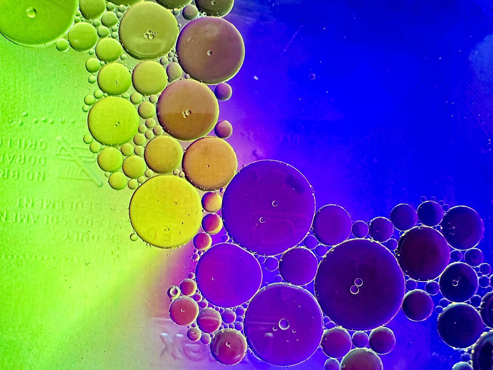
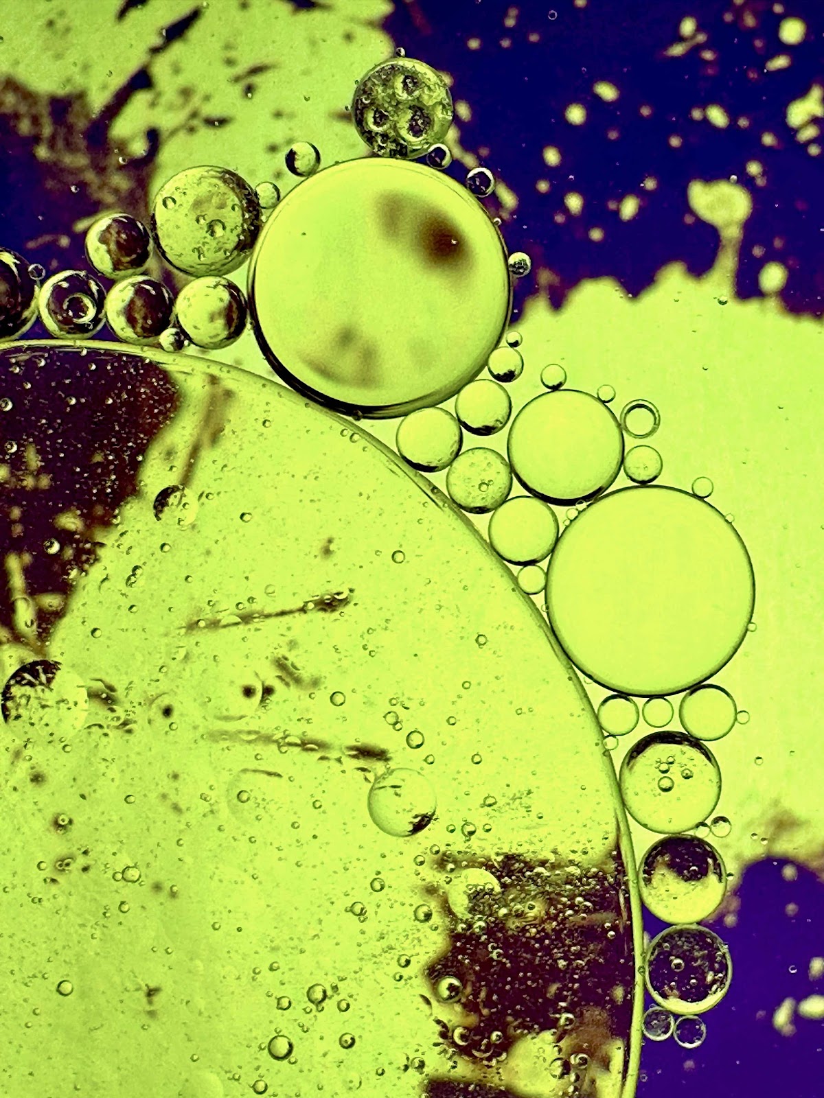
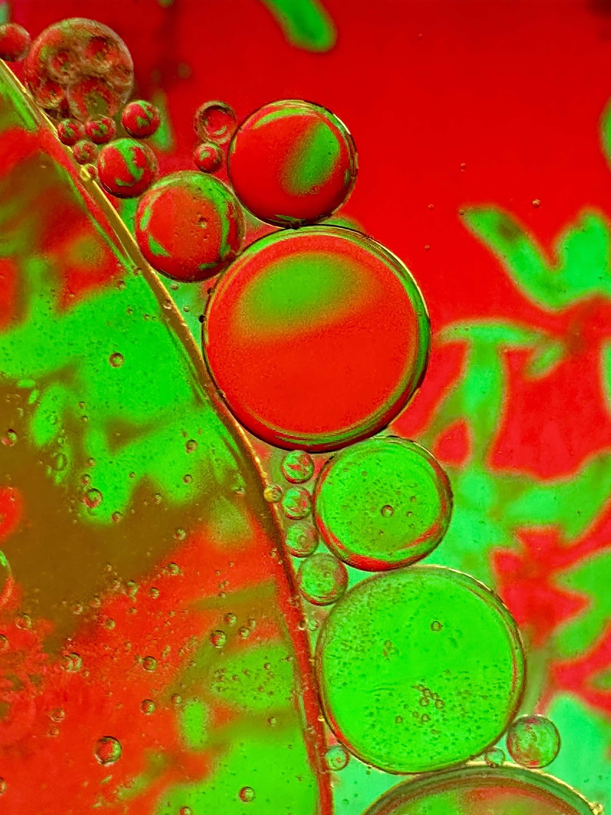
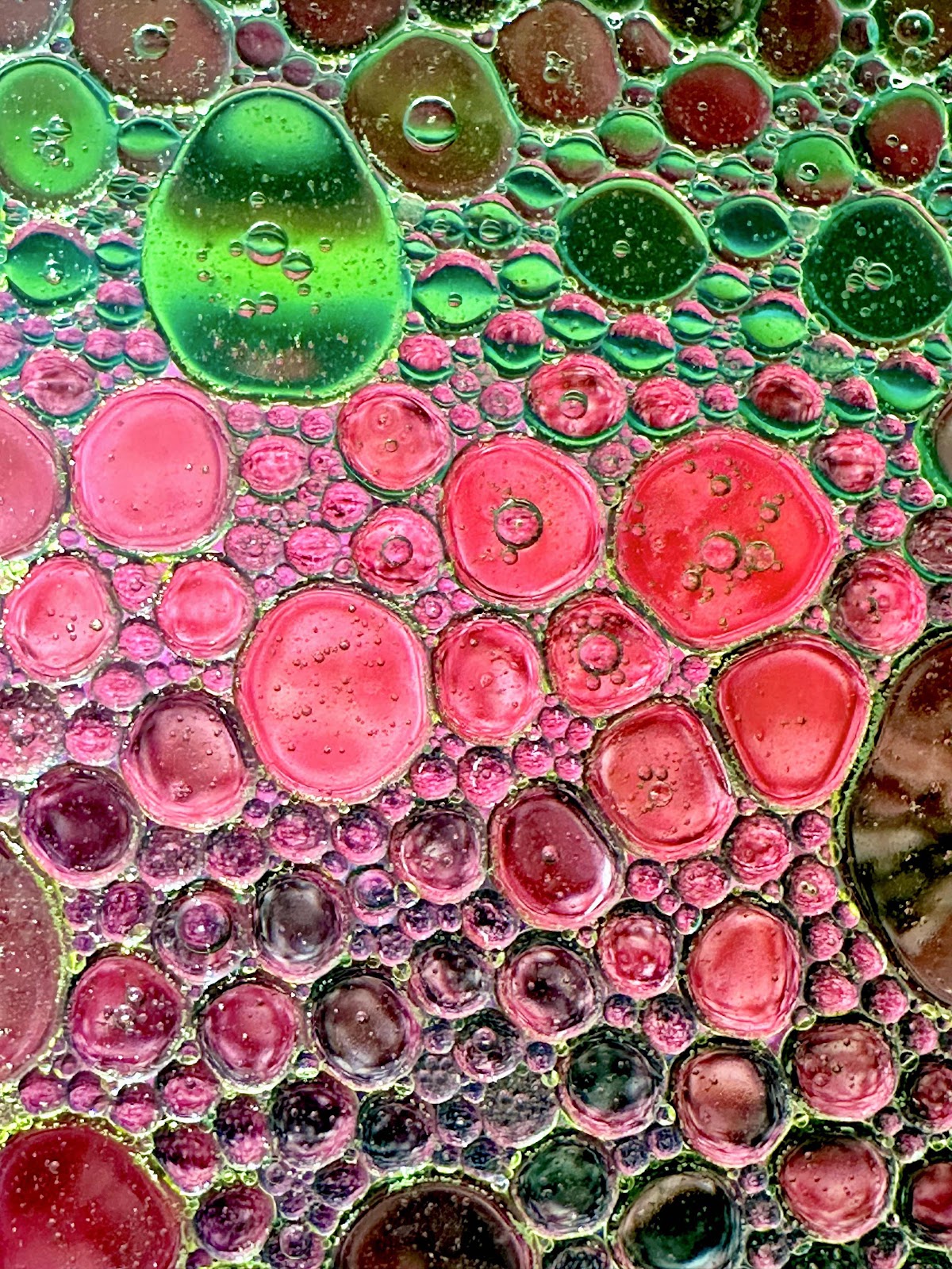
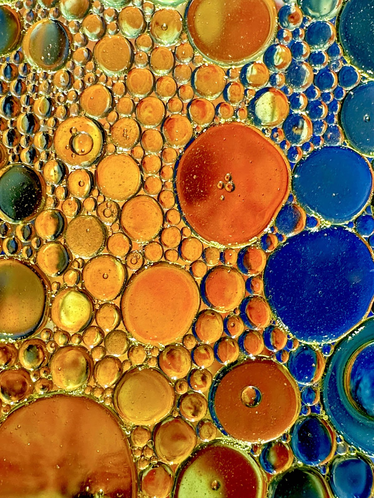
The subject for the weekly 52Frames photo challenge was “complementary colors.” That meant red/green; yellow/purple; or orange/blue. Since I have never done oil and water macro photography before, I thought this might be a good time to try it. So I read up about what I needed to do. It would start out with either photos I have taken in my photo stream or creating a digital artwork using complementary colors. The background images would be seen on my iPad on the highest light, and then a clear glass casserole dish was placed on top of it - after first putting the iPad in a clear freezer bag. Then about an inch or two of water was added to the dish along with drops of oil. Then some dish washing detergent was added so the bubbles would be accentuated. This process went on for a few days - because each time I did it I learned something new, and it was just a lot of fun. The end result was a lot of different abstract bubble art. Of course my husband and I couldn’t agree on what image should be submitted. I liked the obvious bright two color combinations. He liked the image that was visually appealing - whether it met the criteria or not. So I ended up uploading the green/red bubble combination that looked like it was moving, that had a neighborhood park bench as the background. But because some of the bubbles were salmon in color I touched them up a bit to match the other red bubbles in the image. It was a fascinating process, but in the end there were just too many choices!


Monday, March 13, 2023
52Frames Complementary Colors Photo Challenge
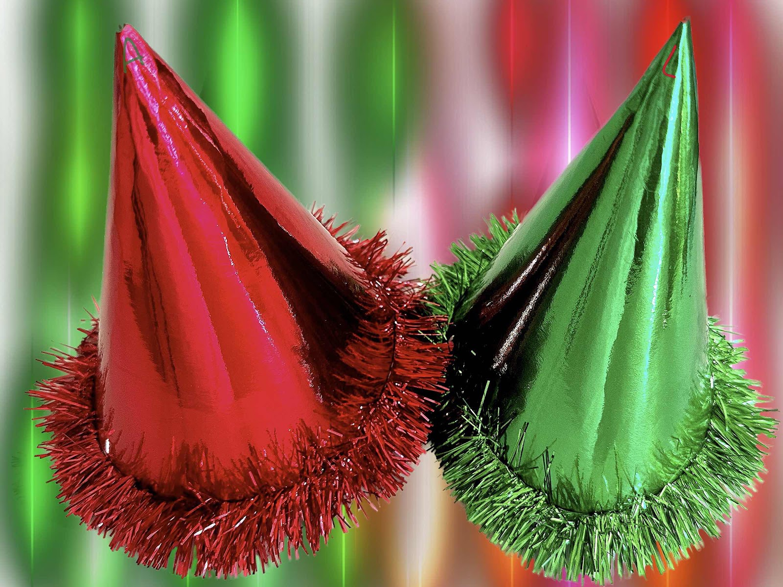
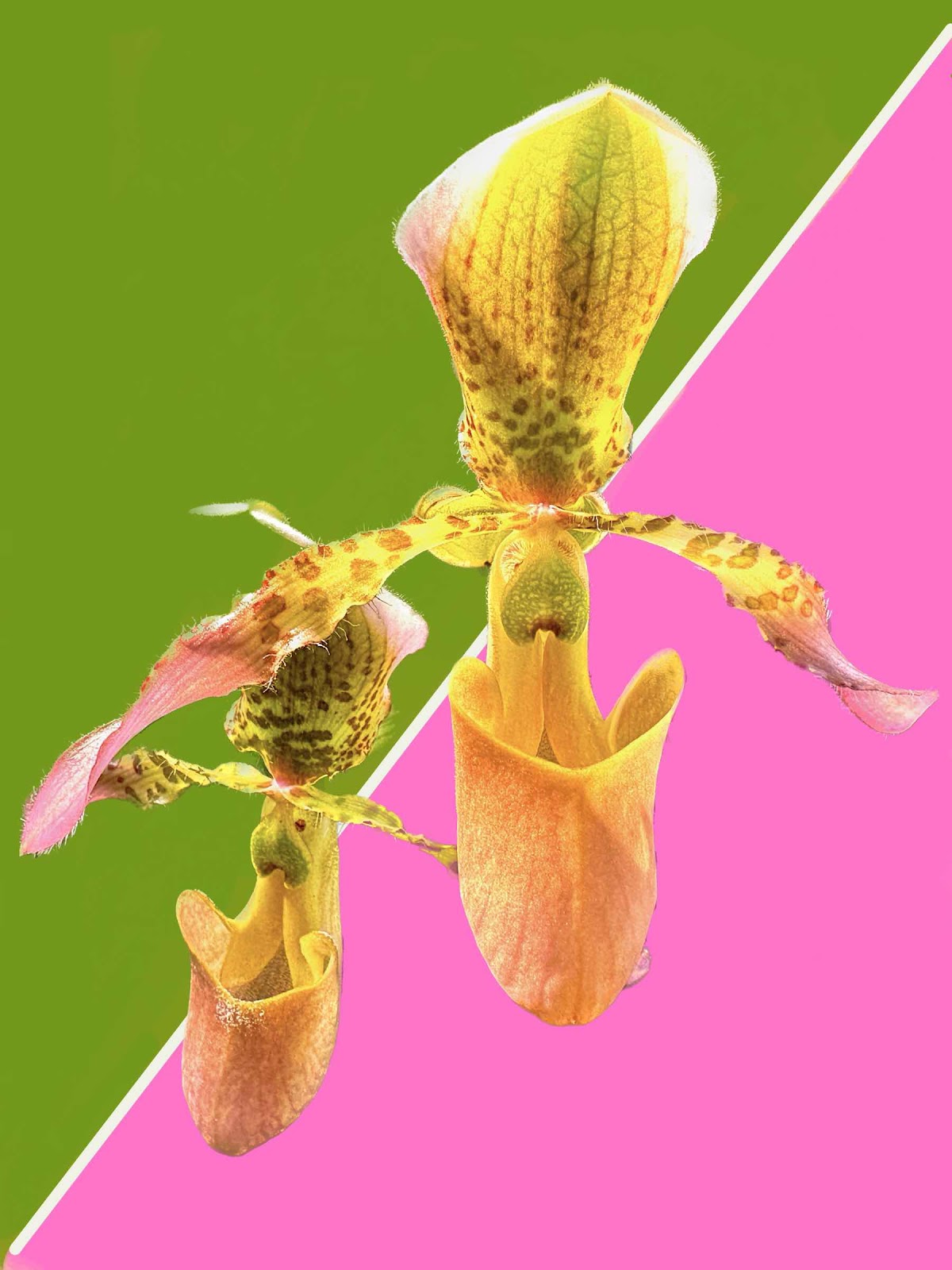
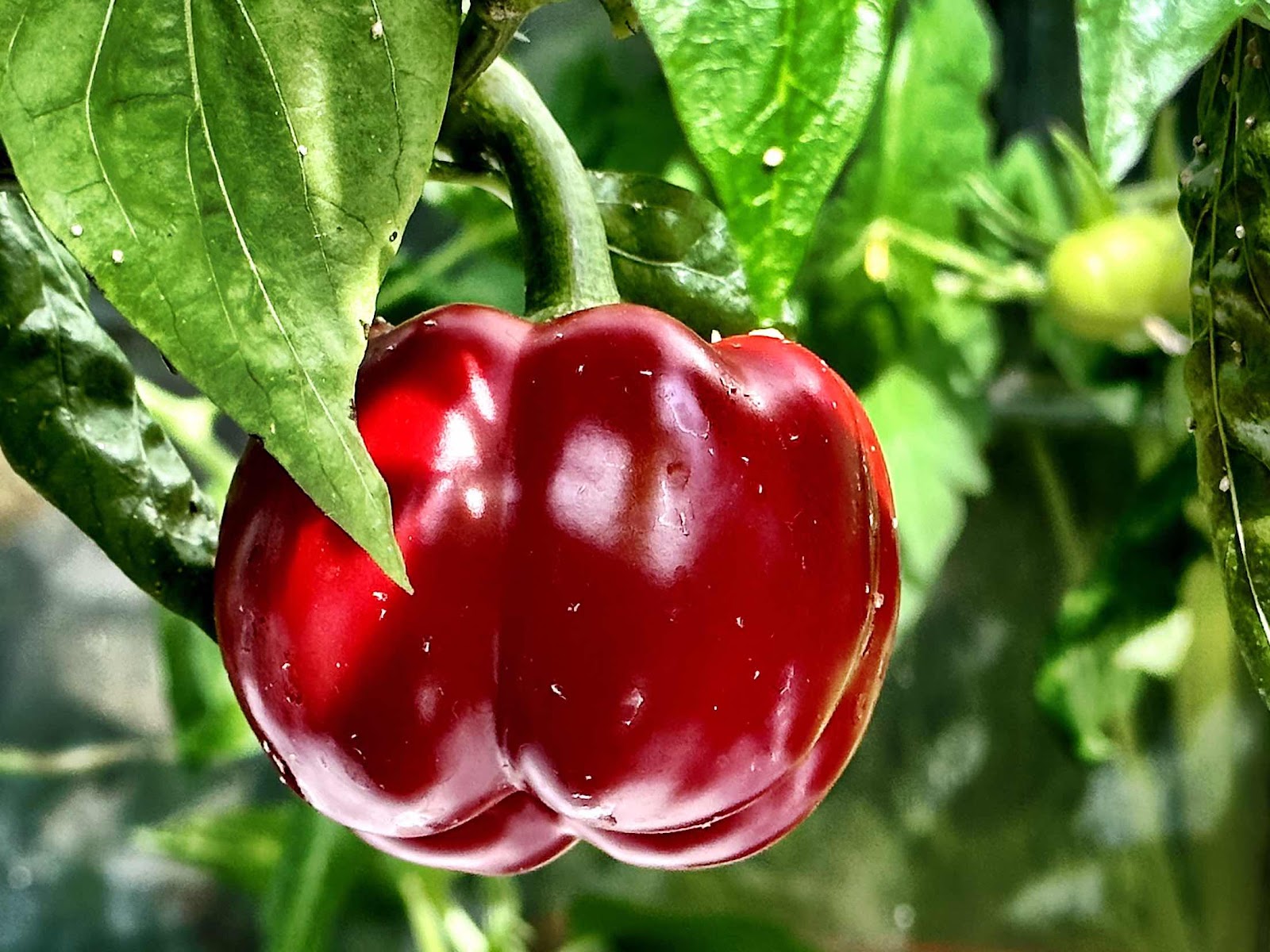
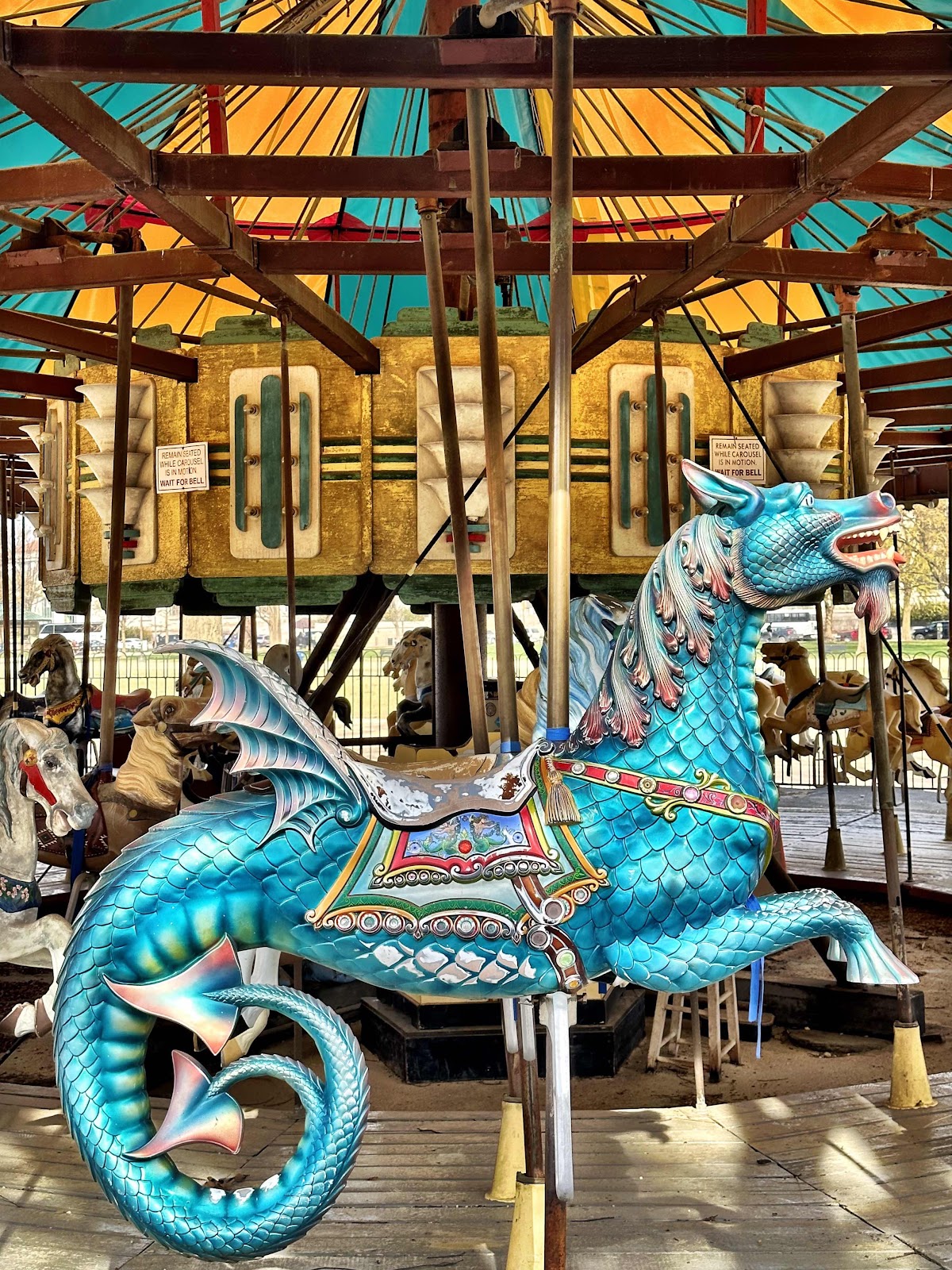
The 52Frames photo challenge this week was “complementary colors.” I’m not so much a fan of this topic. Red/green, purple/yellow, blue/orange… So we drove in to town thinking we might come across something. And of course the carousel on the mall is always an option, but I have yet to use it as an entry because my husband hates merry-go-rounds - even if the photo is actually quite decent. Then we walked over to the US Botanic garden and I found a couple of options there - a red pepper against the green leaves, an orchid, and a leaf with red veins. Then we stopped to see the beautiful saucer magnolias that were blooming in the Enid Haupt garden at the Smithsonian Castle. The pink/green options were plentiful, but didn’t really meet the primary color “definition.” When we came home I thought of our red and green New Year hats that we put on to bring in the next year. Along with the orchid, I edited the items against a different background and spent a lot of time doing that. Lately I have been using my digital art app to edit photos. It’s like finding a new toy and trying to see what I can do with it. I really liked the magnolia photo a lot, but in order to meet the literal definition the hats were submitted. It seems every week I have been submitting images that I have second thoughts about. Maybe I shouldn’t be thinking too hard about these things.
Subscribe to:
Posts (Atom)