Showing posts with label complementary colors. Show all posts

Monday, March 13, 2023

52Frames Complementary Colors Photo Challenge

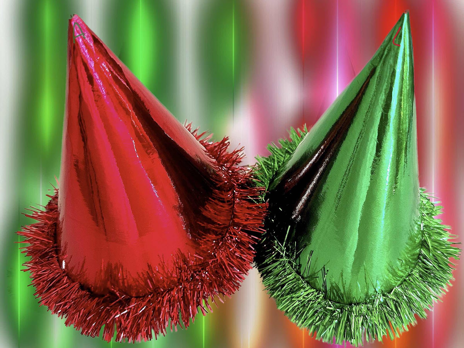
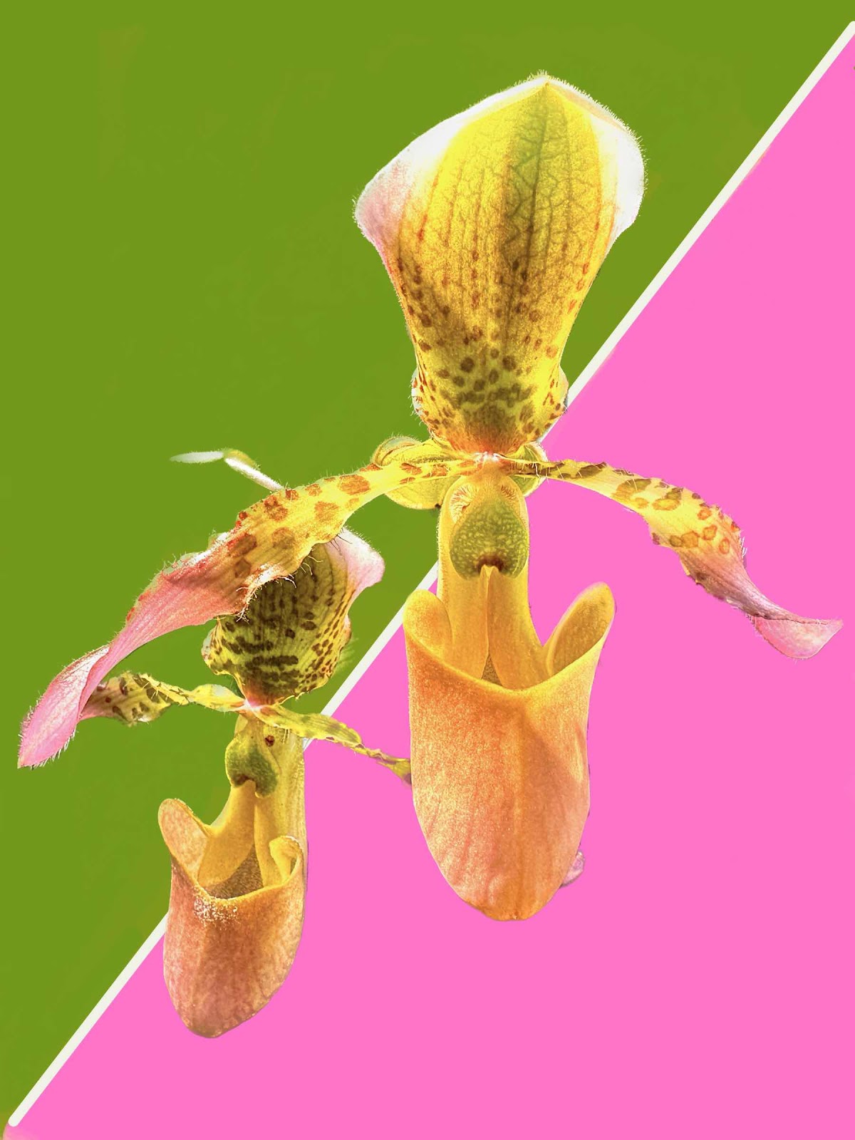
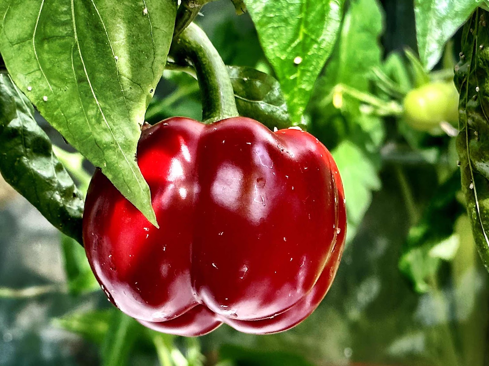
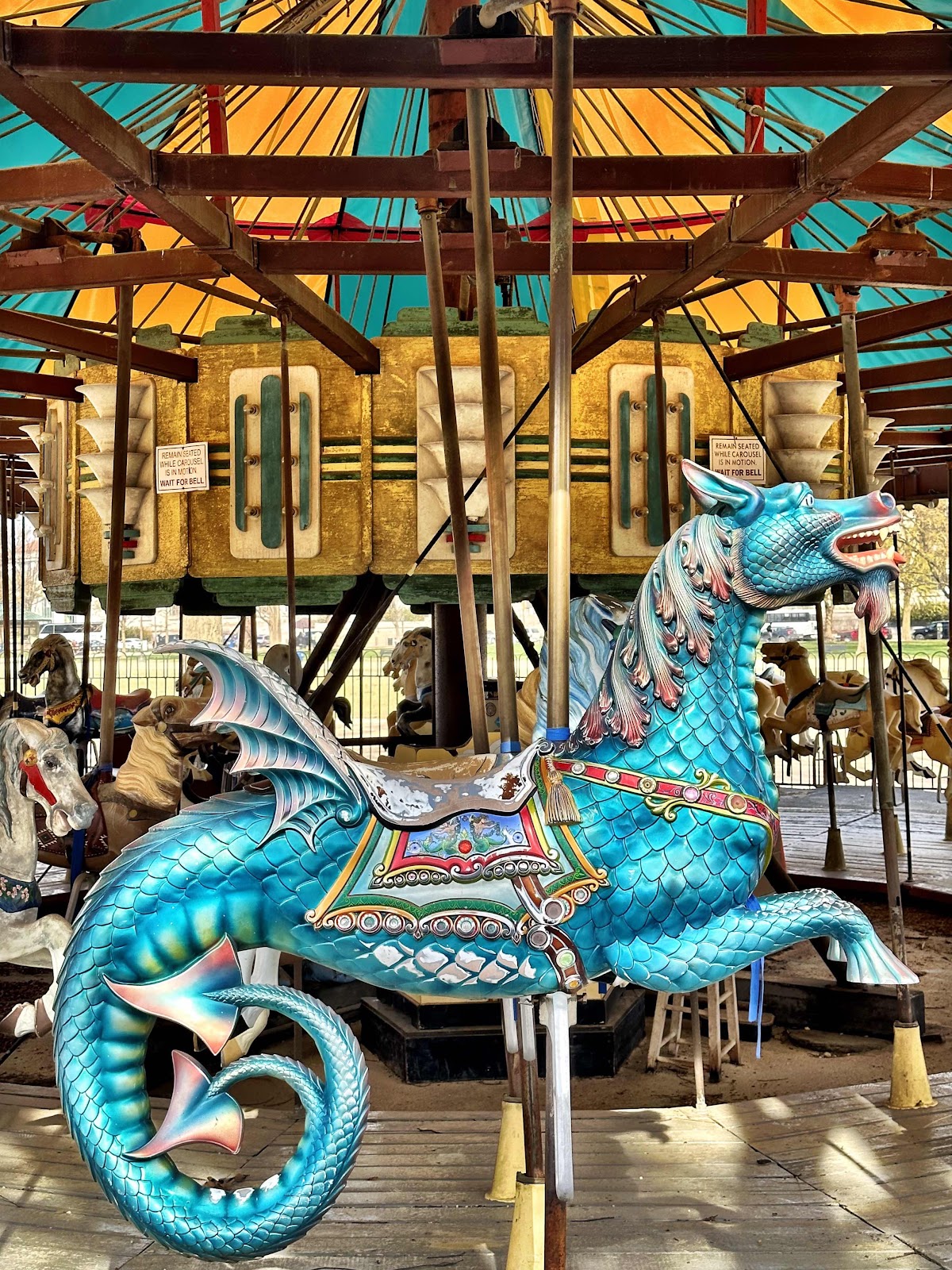
The 52Frames photo challenge this week was “complementary colors.” I’m not so much a fan of this topic. Red/green, purple/yellow, blue/orange… So we drove in to town thinking we might come across something. And of course the carousel on the mall is always an option, but I have yet to use it as an entry because my husband hates merry-go-rounds - even if the photo is actually quite decent. Then we walked over to the US Botanic garden and I found a couple of options there - a red pepper against the green leaves, an orchid, and a leaf with red veins. Then we stopped to see the beautiful saucer magnolias that were blooming in the Enid Haupt garden at the Smithsonian Castle. The pink/green options were plentiful, but didn’t really meet the primary color “definition.” When we came home I thought of our red and green New Year hats that we put on to bring in the next year. Along with the orchid, I edited the items against a different background and spent a lot of time doing that. Lately I have been using my digital art app to edit photos. It’s like finding a new toy and trying to see what I can do with it. I really liked the magnolia photo a lot, but in order to meet the literal definition the hats were submitted. It seems every week I have been submitting images that I have second thoughts about. Maybe I shouldn’t be thinking too hard about these things. 


Monday, January 24, 2022

52Frames Complementary Colors

I thought I knew what complementary colors were. For a weekly photo challenge it has a particular definition. So I had to look up “color wheel” to better understand what it meant. The main opposing colors are red/green; purple/yellow; orange/blue. Before I figured that out we had spent a couple of days taking photos of things that were not in that definition. And even after I thought I got it, it seemed difficult to find something that really worked. We were walking though the US Botanic garden and the purple and yellow cabbages looked perfect. They weren’t crisp colors, but the contrast was definitely there after a bit of editing. There was another cabbage that looked okay, but the yellow wasn’t bright enough. Then we walked down to the Hirshhorn Museum and the orange birdhouse against the blue background looked right. In front of the Arts and Industries building was a sculpture of sorts at the entrance made up of red and green plastic square pieces. That might work. I wasn’t happy with my options so we decided to take a ride to old town Alexandria where there might be a row house that fit the bill. There wasn’t. But what we did find were red and green shutters that stood out from the rest. After putting the images on my business Facebook page and Instagram the shutters seemed to be the winning image. But there was something more artistic about the cabbage, and besides, my husband liked that one more. As far as I was concerned the cabbage and the shutters were equal, so I posted the cabbage. I have a feeling I missed the boat this week. After all, the idea isn’t to “win” the weekly challenge, but just get out and look for something. But I have to admit that when an item gets noticed, it feels good. 


Sunday, January 23, 2022

In Search of Complementary Colors

Before I understood what the 52Frames photo challenge was really about this week, I took a lot of time taking pictures if things that I thought were complementary colors. I thought it meant two colors that just looked good next time each other. But when I read the description again and looked up a color wheel, I figured out I was really out of whack. So these are the losing images. Unfortunately one of them got a lot of likes and comments on my Facebook business page. I sometimes use that as a nudge to select a particular photo. It started out at the recycling bin when we were depositing glass bottles. The purple and rusty gold hinge on the bin looked great. Then the yellow scrambled eggs and the green spinach looked good. How about the gold and blue candy wrappers? Or the winter hat with the Pom Pom? Or maybe the pansie? But when I looked at the color wheel I realized that complementary colors were on opposite sides of the wheel - green/red; orange/blue; yellow/purple - with shades in between. So I had to start all over again. It’s really important to read the definition before taking photos. It’s all just for fun anyway.